

Colour Psychology Guide
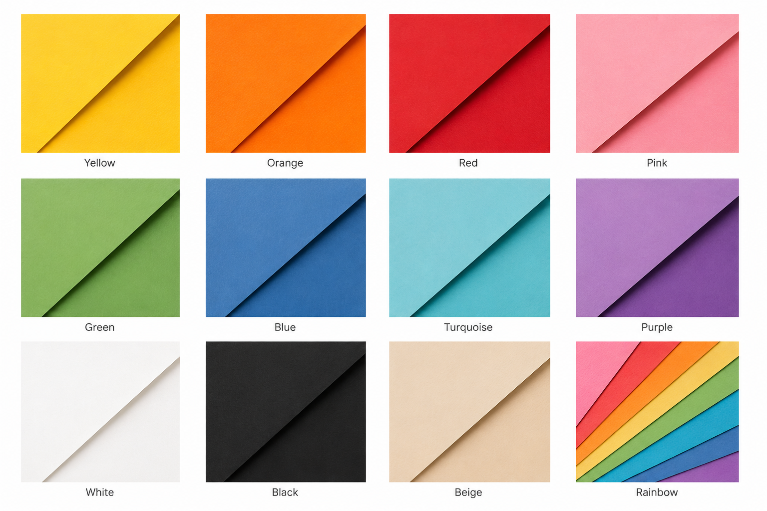
At Amatus, colour is at the heart of everything we create. Every print is designed using carefully chosen colour palettes inspired by findings from colour psychology, helping you select artwork that not only complements your interior but also the atmosphere you want to create.
While colour affects everyone differently, research suggests that certain colours are commonly associated with particular emotions and behaviours. Factors such as personal experiences, culture and lighting all play a role, but colour remains one of the most powerful tools in interior design for shaping how a space feels.
Whether you're searching for colourful wall art to energise a room, calming artwork for a relaxing bedroom, or playful prints for a child's nursery, this guide explains the inspiration behind the colours we use throughout our collections.
Yellow
Yellow is often associated with optimism, happiness and creativity. Research suggests it can help create a feeling of warmth and energy, making it a popular choice for kitchens, home offices and social spaces. Softer yellows create a gentle uplifting atmosphere, while brighter shades add vibrancy and positivity.
Often associated with:
Optimism
Happiness
Creativity
Energy
Confidence
Orange
Orange combines the warmth of red with the optimism of yellow, creating a colour often linked with enthusiasm, sociability and playfulness. It works particularly well in family spaces and children's bedrooms where a welcoming, energetic feel is desired.
Often associated with:
Enthusiasm
Warmth
Confidence
Friendliness
Creativity
Red
Red naturally attracts attention and is often associated with energy, excitement and passion. Studies suggest it can increase feelings of stimulation and alertness, making it best suited to spaces where you want impact rather than complete relaxation.
Often associated with:
Energy
Passion
Excitement
Confidence
Motivation
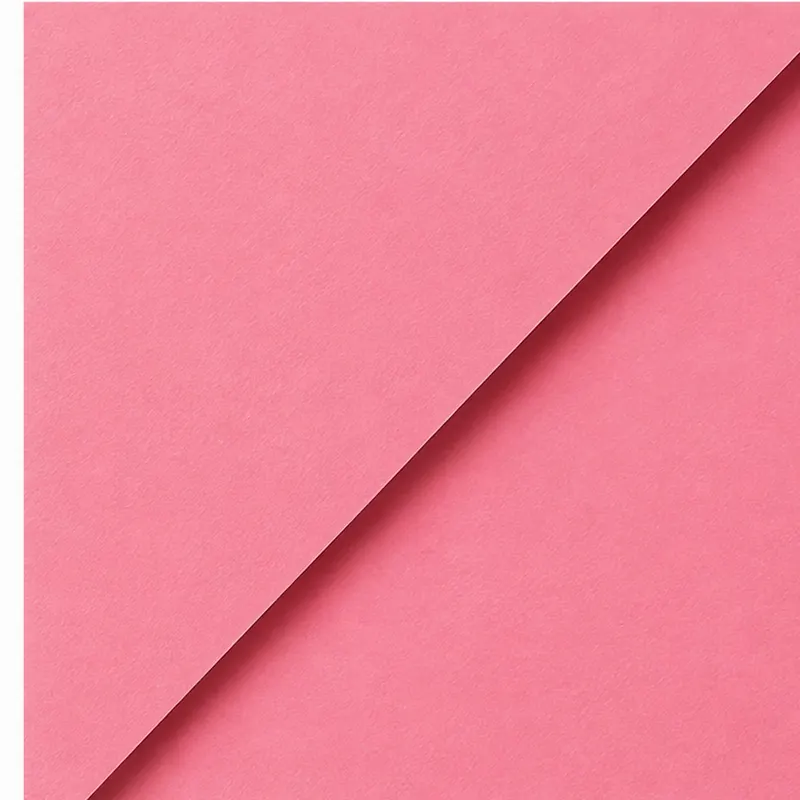
Pink
Pink is widely associated with kindness, warmth and comfort. Softer pinks often create nurturing and peaceful environments, while brighter pinks add a playful, joyful character.
Often associated with:
Compassion
Calm
Warmth
Playfulness
Kindness
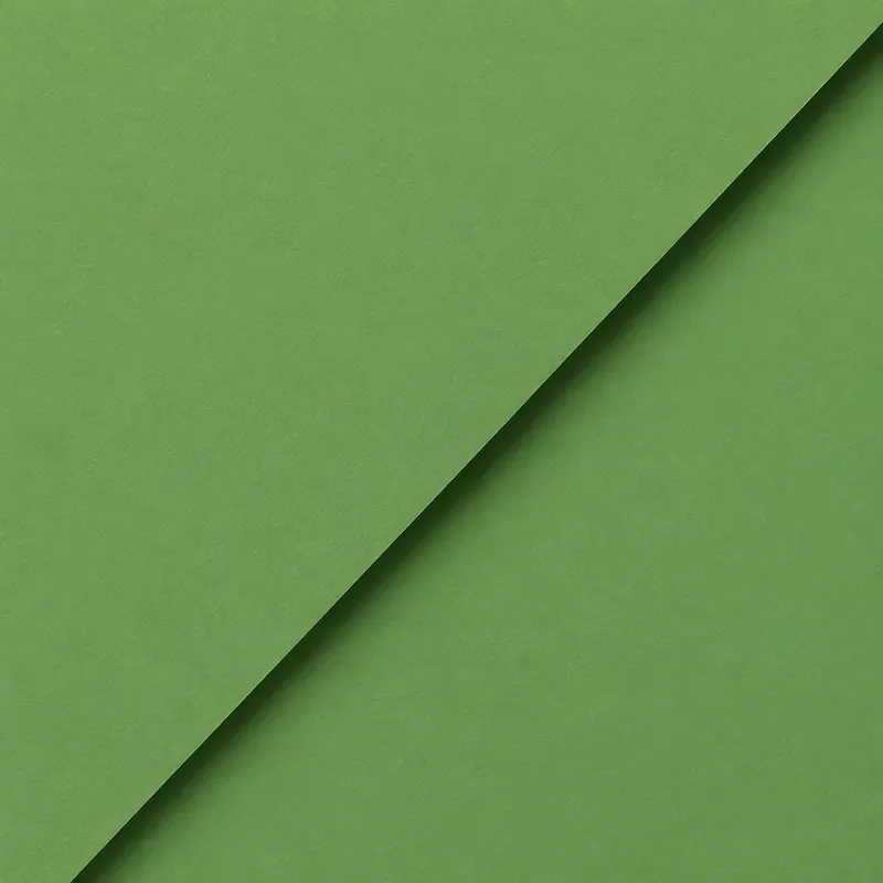
Green
Green is strongly connected with nature and is one of the colours most consistently associated with calmness, balance and restoration. Research has found that natural green environments may help reduce stress and mental fatigue, making green artwork a popular choice for living rooms and bedrooms.
Often associated with:
Calm
Balance
Nature
Growth
Restoration
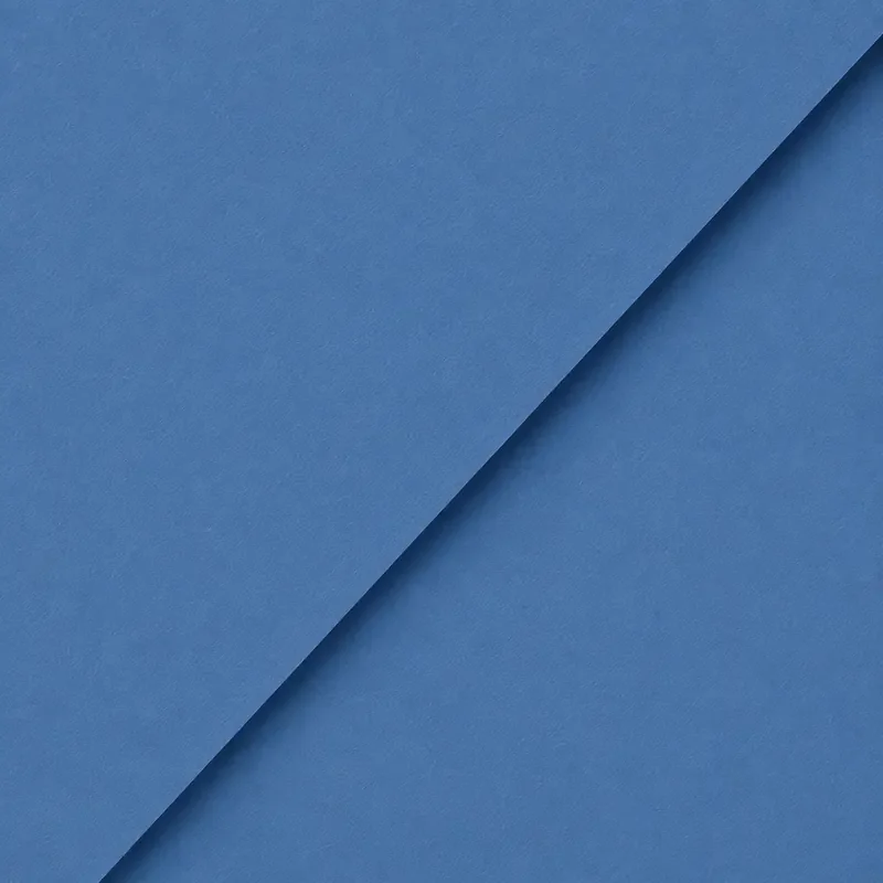
Blue
Blue is frequently linked with relaxation, trust and tranquillity. Studies have found that blue environments are often perceived as calming and can encourage a peaceful atmosphere, making blue a popular choice for bedrooms and quiet spaces.
Often associated with:
Calm
Trust
Relaxation
Stability
Serenity
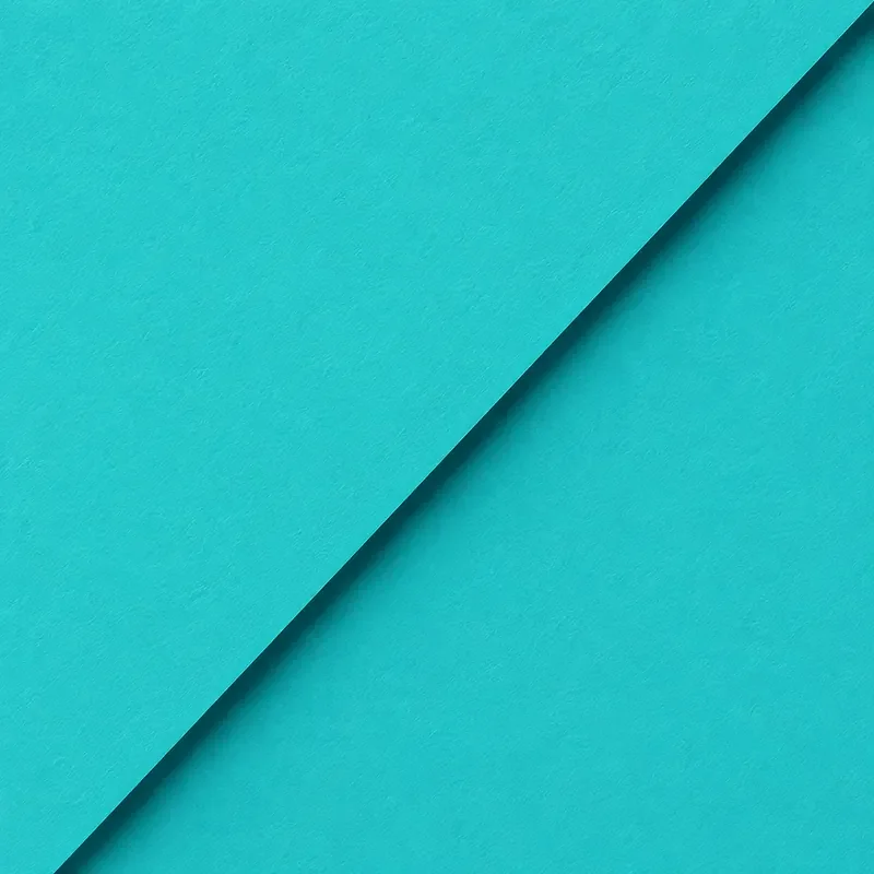
Turquoise
Turquoise combines the calming qualities of blue with the refreshing feel of green. It is often associated with clarity, balance and creativity, making it ideal for modern interiors that feel light and uplifting.
Often associated with:
Clarity
Freshness
Creativity
Calm
Balance

Purple
Purple has long been associated with creativity, imagination and individuality. Softer lavender tones create peaceful spaces, while deeper purples add richness and sophistication.
Often associated with:
Creativity
Imagination
Luxury
Wisdom
Reflection
White
White is often associated with simplicity, clarity and openness. In interiors it creates a sense of space and allows other colours to stand out, making rooms feel lighter and more peaceful.
Often associated with:
Simplicity
Clarity
Freshness
Space
Calm
Black
Black adds contrast, sophistication and visual balance. Used thoughtfully, it creates definition within a room and can make colourful artwork appear even more vibrant.
Often associated with:
Sophistication
Strength
Elegance
Confidence
Contrast
Beige & Natural Tones
Neutral colours help create calm, balanced interiors that feel timeless and welcoming. They provide a gentle backdrop that allows colourful artwork to become the focal point of a room.
Often associated with:
Comfort
Warmth
Stability
Balance
Simplicity
Rainbow Colours
Rainbow colours represent the ultimate balance of human emotion- combining the energy of warm tones with the calm of cool hues to symbolise inclusivity, creativity, and boundless optimism.
Often associated with:
Inclusivity
Creativity
Wonder
Attention
Optimism

At Amatus, every colour palette is chosen with intention. By combining thoughtful design with inspiration from colour psychology, we create contemporary wall art that helps bring personality, warmth and balance to your home. Whether you're drawn to vibrant, uplifting colours or softer, calming tones, we hope this guide helps you find artwork you'll love for years to come.